
o.b. is the market leader and brand synonymous of the category.
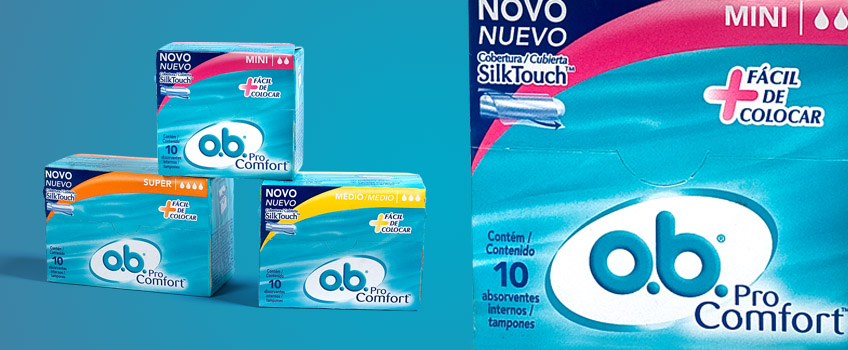
The brand faced a major challenge in 2010, which was to differentiate the packaging line Helix (regular) from the Pro Comfort line. At POS, those packages became confused on the shelves and not clearly expressing the differences between the versions.
Due to the large global brand alignment, only minor changes in packaging are permitted locally and for a limited period.
Considering that, we proposed to redesign some elements in order to give greater femininity and joviality to the Pro Comfort versions, highlighting the main attribute and benefit of the product.
The new design was utilized in the Pro Comfort relaunch in April 2011.